
inktrail is a mobile app that encourages exploration and connection through the gamification of letters.
INKTRAIL

ROLE
UX Designer & Researcher
TOOLS
Figma


PROBLEM STATEMENT
“How might we use shared experiences to connect people to the physical world and each other?”
There are limited opportunities for people to meet and connect with others outside of work and school, and what does exist can make people feel awkward and insignificant.
PROBLEM
SOLUTION
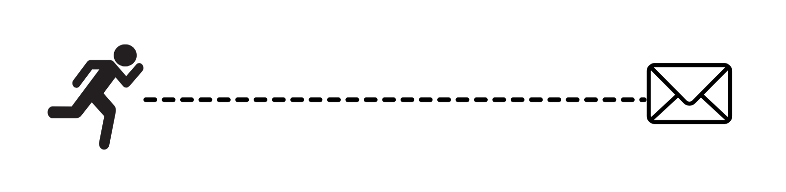
An app that combines the adventure of scavenger hunts with the personal connection that can be found through letters.
RESEARCH
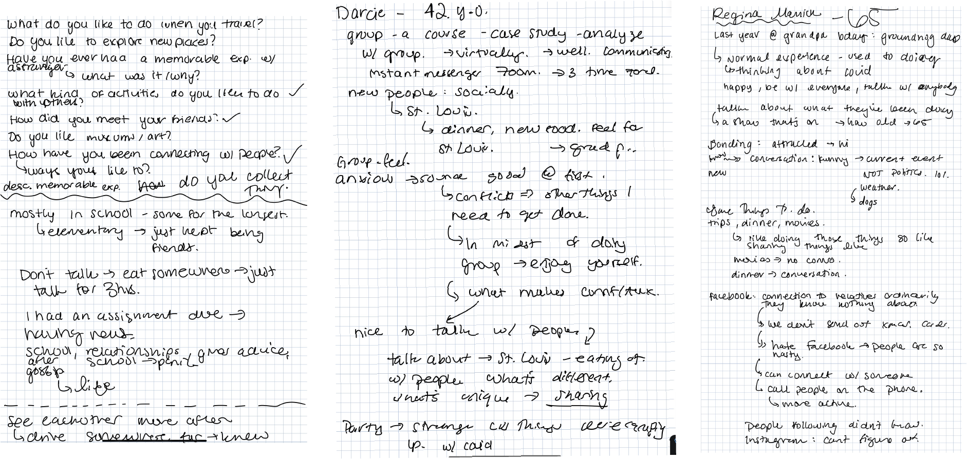
I conducted a series of 1-on-1 interviews with 6 users aged 18 to 60. Each interview was 30 minutes in length—questions centered on people’s experiences bonding with others both in the real world and digital spaces.
The goal of the study was to understand the contexts and motivations that resulted in experiences where people felt like they had meaningful interactions with others.
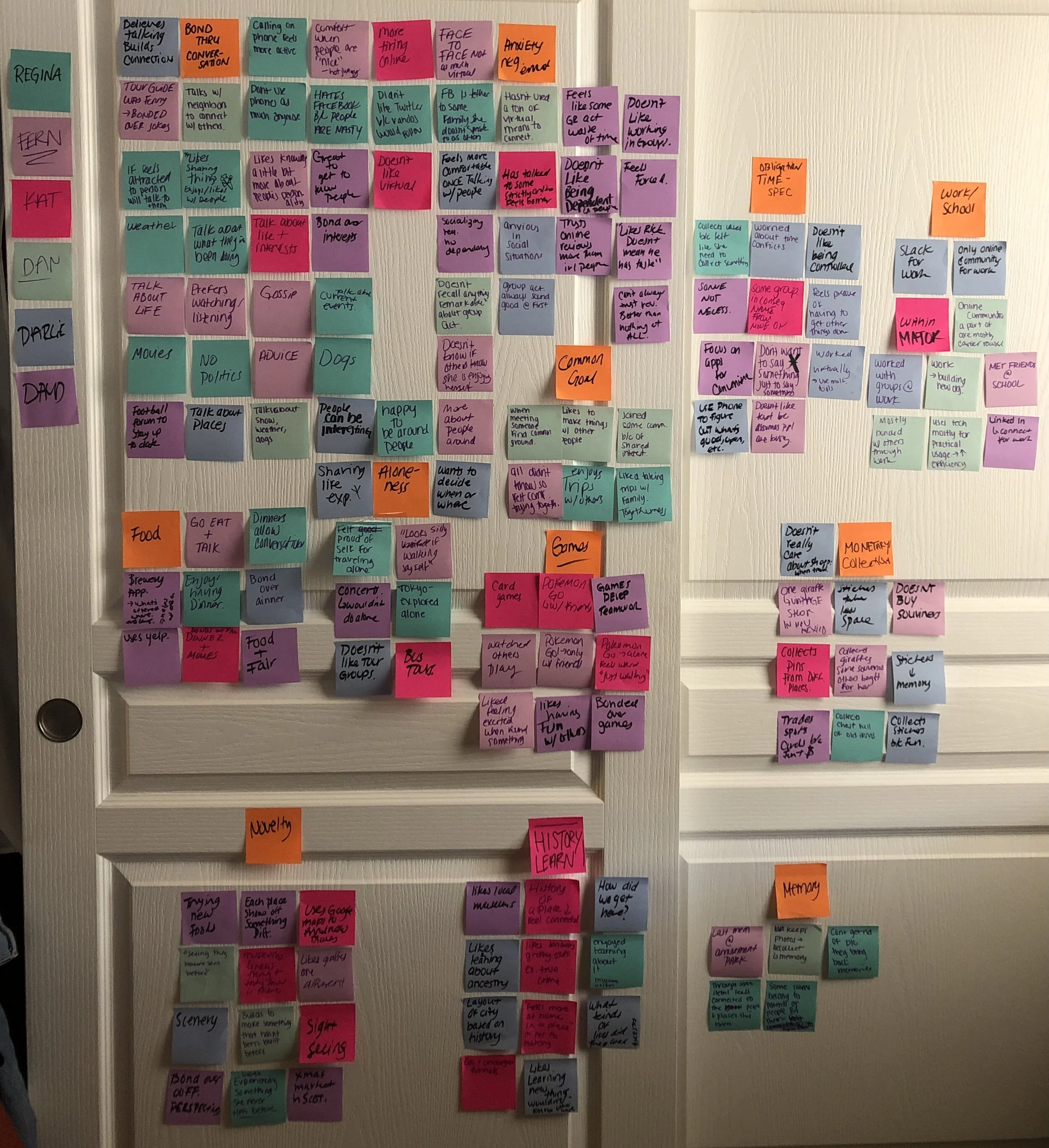
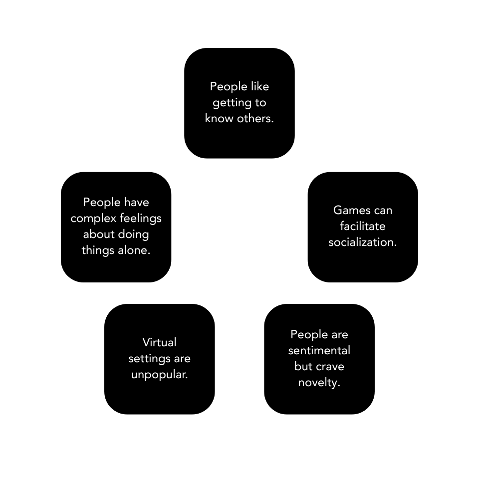
RESEARCH FINDINGS
These interviews revealed patterns that informed my solution. The people I spoke to expressed the desire for more interactions that weren’t fully mediated digitally, while also craving connections that didn’t feel surface-level. Games frequently came up as a popular way to bond with people, which allowed people to overcome initial awkwardness as well. This led me to inktrail.
IDEATION AND WIREFRAMES
I considered letters as a solution since they require vulnerability and thoughtfulness. As a result, letters appeal to sentimentality while initiating meaningful connections. Like a present, opening a personal letter is exciting. The final piece of the puzzle was incorporating the game mechanics of a scavenger hunt so that Inktrail would not be confined to the digital sphere.
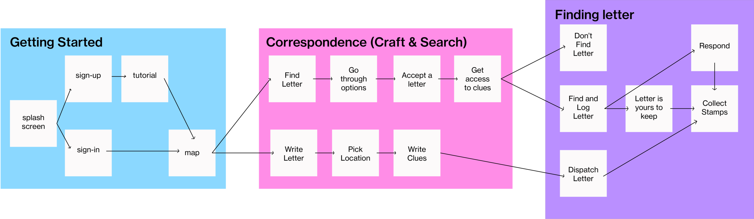
I was inspired by Geocaching and Pokemon Go. In my initial user flow, I incorporated mechanics like adding clues and achievement badges. Looking back, a more elegant solution would be having users mark a general location or place instead of asking them to come up with clues. This places less burden on them and allows them to focus more on the letters.
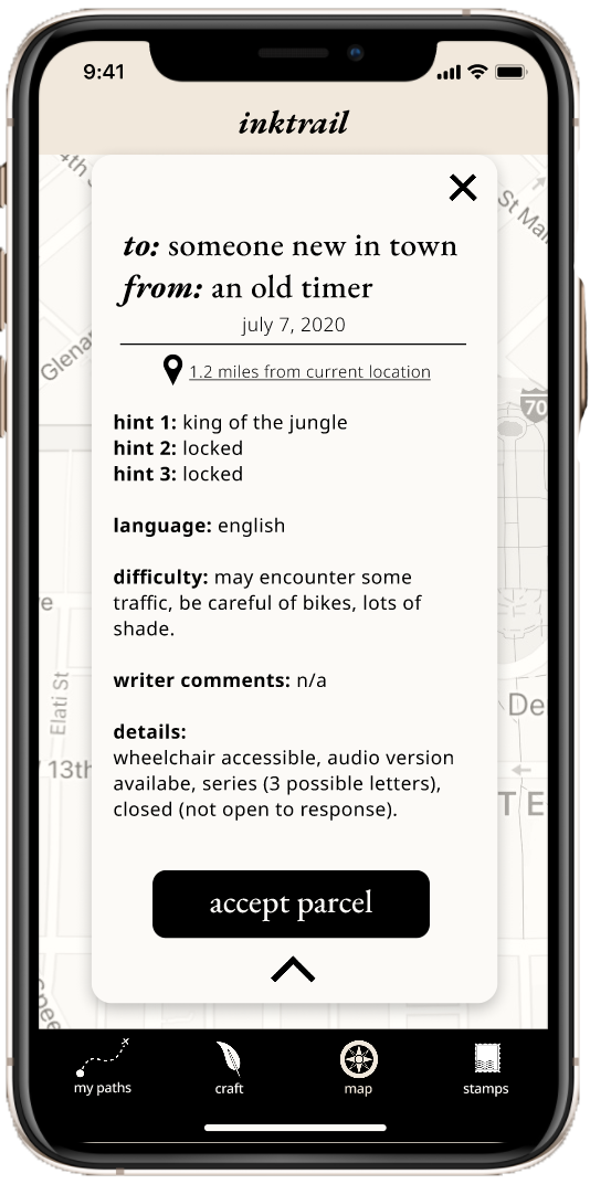
“FINAL” PROTOTYPE
In my final prototype, I incorporated colors found in postage, like the creams in paper and the reds in wax seals. Serif fonts also felt appropriate. For future iterations of this project, I would focus on more user testing to finesse the mechanics of the application. I would also bring the design up-to-date.